 A logo, colours, typography – for every organisation, these are aesthetic decisions.. DSW’s previous logo – as I am sure some of you will remember – was inspired by our name and original purpose, and consisted of a globe with dancing people. The colours we used to define ourselves were kept to muted dark red and grey tones. But did this dour style really represent our foundation and what we are working for? Not a bit! It simply didn’t reflect the fact that our focus is on activating the potential of young people in developing countries, and helping them to progress in their lives.
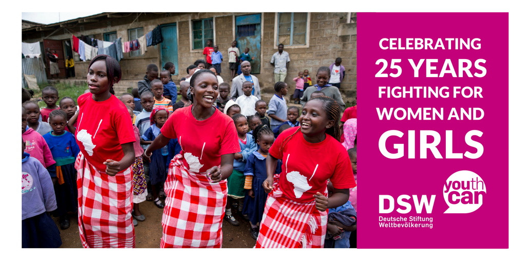
DSW rebrands: a new look and a new name
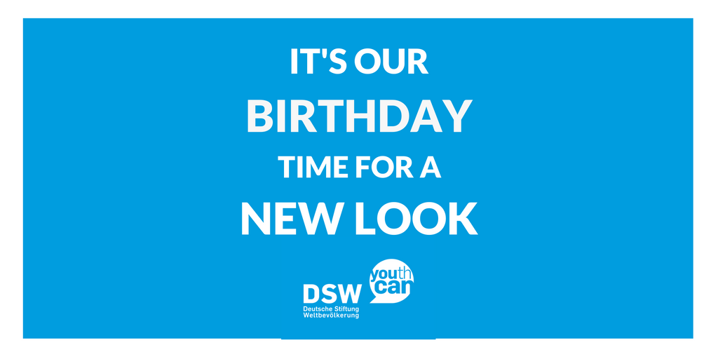
There has always been the dissonance between our communication about ourselves in Germany and in the rest of the world. Calling ourselves “Stiftung Weltbevölkerung” in the German logo, but “DSW” in English, was something that always caused problems. It was like, “which are we then”? DSW, or Stiftung Weltbevölkerung? Or possibly Deutsche Stiftung Weltbevölkerung? Was it even appropriate to say DSW in German? As the organisation has matured, these have become very real concerns, inhibiting our ability to really talk about who we are and what we do. We decided that there was no better time for a change than our 25th anniversary in 2016!
Last year, in preparation, we launched a branding process involving colleagues from across all our offices and all departments – in Europe and eastern Africa – as well as representatives on our boards. They were asked for their views on our image, our work, and their ideas for a new corporate design. In particular we wanted to make sure that our brand in future reflected the core of who we are as an organisation. This process yielded a clear brand identity for DSW:
“We build on the inventive power that drives young people. Providing information and education we activate potentials for a self-determined life – and create sustainable perspectives for strong communities and a future-oriented society.”
And now? How should we implement this, in terms of how we present ourselves to the world? Three words that emerged from the brand development process were key. They were: close, active, and strong. For example, we needed strong, bold colours (instead of a reserved mouse-grey), and a more modern and “active” logo that better represented our youth focus.
DSW rebrands: our new slogan – you(th) can!
In the end, it really didn’t take long to decide on a logo that met all our needs:
![]()
What I particularly like is that now, finally, we have just one name again in German and English: Deutsche Stiftung Weltbevölkerung (DSW). No more confusion!
Some of you may be wondering what has become of the old foundation – if you think being 25 is old! I can assure you all that we are still the same organisation, committed to continuing our 25 years of successful, innovative work to benefit young people in developing countries. It’s just that we’ve given ourselves a new look to match the content: Youth can!
Ute Stallmeister, Senior Media Officer, DSW